American EMR
Patient healthcare mobile application
An all-in-one patient portal centralizing appointments, records, prescriptions, billing, and messaging — designed during a week-long design internship.
Role
Product Design Intern
Tools
Figma
Type
Mobile Design
Duration
1 week

The Problem
Healthcare apps are fragmented and outdated.
Patients manage their healthcare across separate apps with no unified place to schedule appointments, view records, or pay bills. The friction leads to missed appointments, skipped refills, and disengagement from care.
Fragmented
Records, billing, and scheduling live in separate places.
Missed Appointments
No centralized reminders or easy rebooking.
Skipped Refills
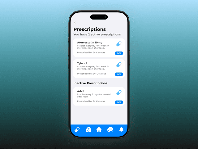
Prescription management buried deep in legacy portals.
Goal
One app for the entire patient experience.
Process
From research to prototype in a week.
Research
Reviewed AMR user data and ran patient interviews to map pain points across navigation and core features.
Visual Design
Defined a blue trust-first color system, Montserrat typography, and a reusable component library.
Prototype
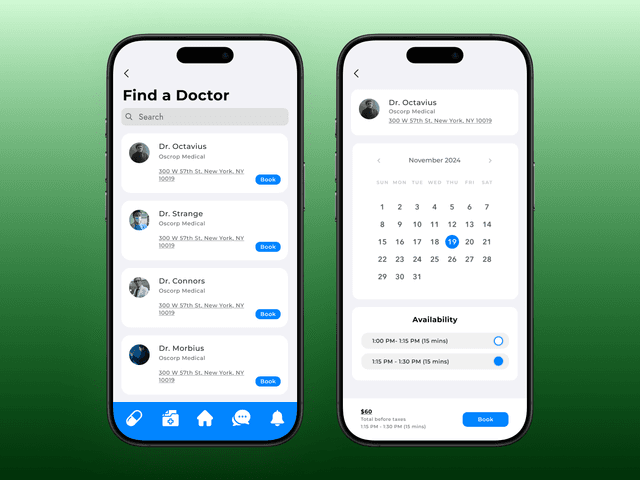
Built interactive Figma flows across 7+ screens — from login through billing and messaging.
Iterate
Three rounds of testing refined navigation, the Quick Highlights widget, and sticky menu structure.
Research
Three personas, three distinct frustrations.
Interviews with existing patients surfaced the core pain points. Each persona represented a different failure mode in the current experience.


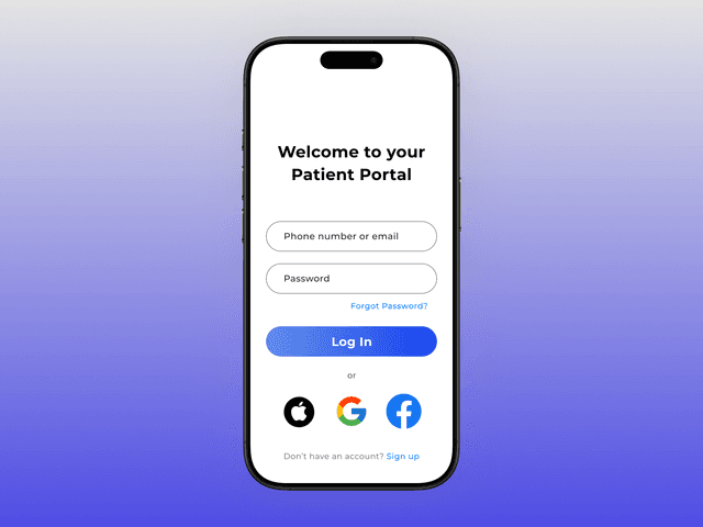
Designed for clarity at a glance.
A trust-first blue palette, clean typography, and a dashboard that surfaces what matters immediately.

Iteration
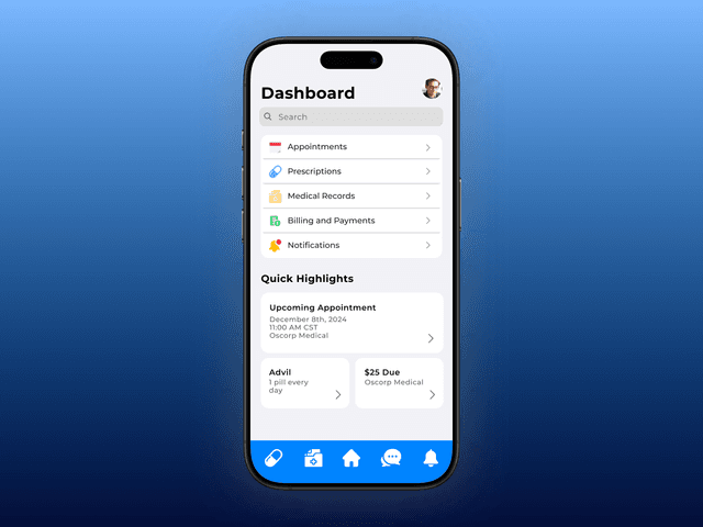
Three rounds to get Quick Highlights right.
After completing the home dashboard, unused space led to a new feature: a widget that surfaces key patient info — reminders, appointments, missed payments — at a glance. Getting the balance of clarity and visual weight took three passes.


Widget-style cards
Black titles and icons for visual recognition. Arrows and a "details" label indicated clickability. Consistent with the dashboard arrow motif.

Simplified
Removed icons and "details" text — arrows already implied clickability. Increased arrow size for better continuity. Users found it too uniform to scan.

Final
Reintroduced icons for identifiability at a glance. Dropped the "details" text. Balanced visual load between V1 and V2.
Design Decisions
Two decisions that changed the experience.
Back arrows in subpages
Users couldn't reliably navigate back — the home icon wasn't intuitive enough. A back arrow at the top of each subpage, consistent with the dashboard's arrow motif, resolved it immediately in testing.

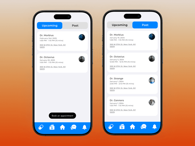
Expanding the sticky navigation
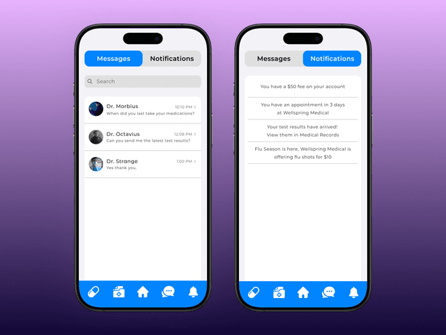
The initial 3-icon menu left out Medical Records and Notifications entirely, forcing patients back to the dashboard. Expanding to 5 icons, removing text labels, and switching to filled icons improved coverage and scanability simultaneously.

3 icons with text labels — Prescriptions, Home, and Chats. Medical Records and Notifications were missing entirely.

5 filled icons, no text labels. All key sections accessible from anywhere in the app.
7+ screens. One cohesive experience.
A fully prototyped patient portal that balances information density with ease of use.

Unified patient portal
Quick Highlights widget
5-tab sticky navigation
3 rounds of iteration
Build the library first
Not setting up a component library from the start was the biggest mistake — it slowed iteration and introduced inconsistencies I had to chase down in every round.
Align with engineering early
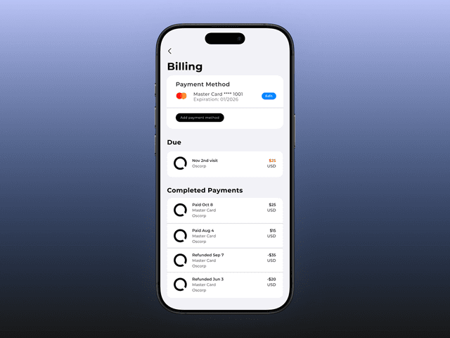
The appointment booking flow and payment UI both hit feasibility walls with the dev team. Earlier conversations would have prevented late-stage redesigns.
Domain knowledge matters
Healthcare design has specific trust and accessibility requirements. Deeper domain knowledge earlier would have surfaced constraints I only found through iteration.
Component library from day one
Start every project with variants, instances, and auto-layout before a single screen is designed. Non-negotiable.
Engineering-aware design
Align with engineering on constraints before committing to complex interaction patterns. Design with implementation cost in mind.
Deeper healthcare domain knowledge
Invest in understanding healthcare workflows, compliance requirements, and accessibility standards specific to medical products.